Behr Just Named Its 2027 Color of the Year. Here's My Honest Take as a Realtor.
Behr announced its 2027 Color of the Year this week, and I have thoughts — some enthusiastic, one cautionary.
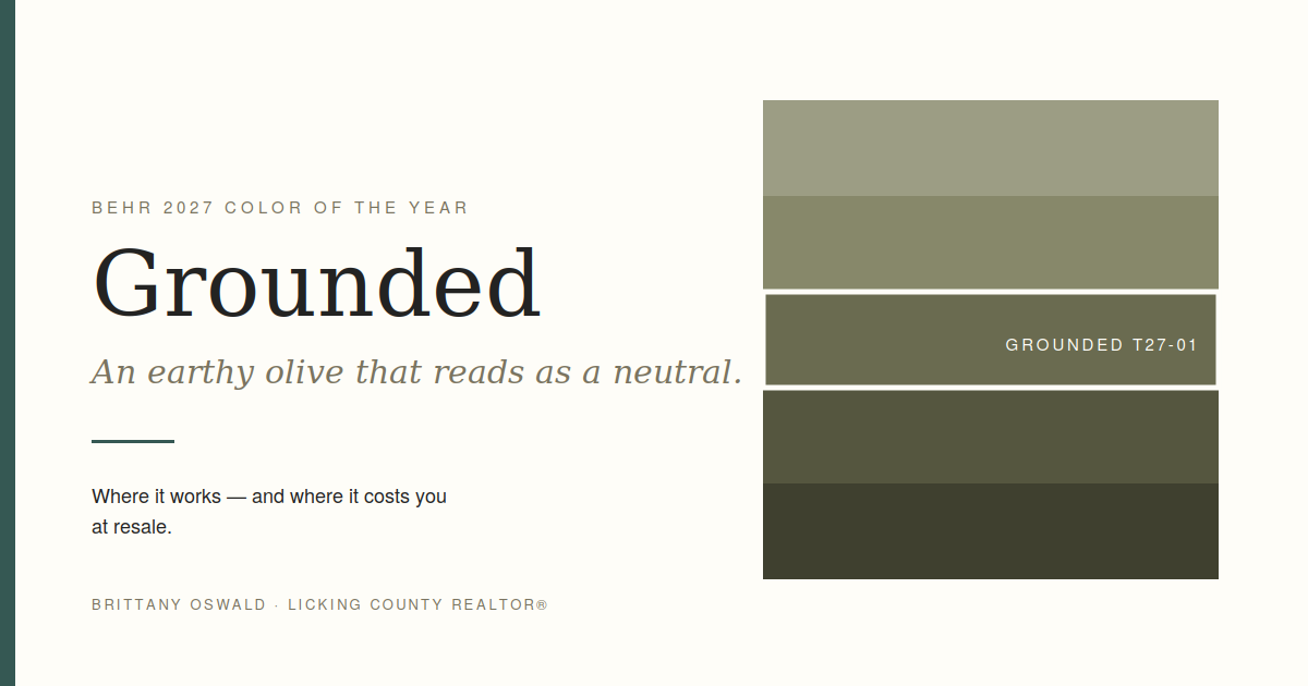
The color is Grounded (T27-01). It's an earthy olive green that shifts between olive and moss, with brown undertones underneath. Behr describes it as restorative and calming, and it marks the tenth year of their Color of the Year program.
Kayla Kratz, Behr's head of color, framed it around connecting to the rhythms of everyday life. Their research found that 77% of Americans say they turn to nature when life feels chaotic — which is a pretty good summary of why every paint brand keeps moving toward greens and earth tones.
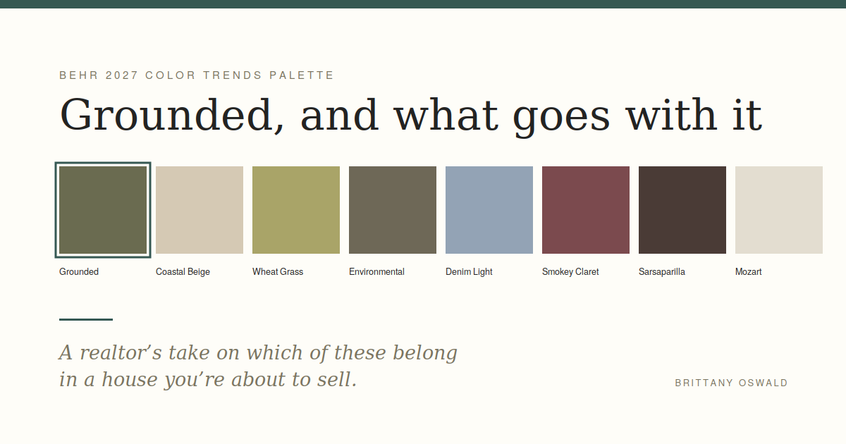
It also comes with a supporting palette that brings back seven older Behr colors: Coastal Beige, Wheat Grass, Environmental, Denim Light, Smokey Claret, Sarsaparilla and Mozart.
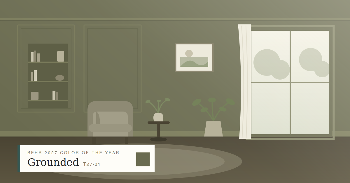
Full disclosure: I've basically been using this color for two years
You can see it in my logo and all over my Instagram. So I'm not exactly an unbiased party on olive green.
I like it because it does something most trend colors don't — it reads as a neutral. It goes with wood tones, with white trim, with black hardware, with brass. It's dark enough to feel intentional and muted enough not to shout.
If you've been staring at a beige living room wondering how to make it feel like something, this is a genuinely good answer.
Where I'd actually use it
A home office or study. This is where deep greens earn their keep. It reads as focused rather than heavy, and it photographs beautifully.
Kitchen island or lower cabinets. Olive-green lowers with a lighter upper cabinet is a look that's held up for years now and shows no sign of dating badly.
A front door. Enormous impact, one afternoon, one quart of paint. If your curb appeal needs something and you're not repainting the whole exterior, this is the move.
Built-ins and shelving. Painting built-ins a shade darker than the walls makes a room look custom. This color is perfect for that.
A powder room. Small rooms are the right place to be brave. Nobody spends an hour in there.
And now the part a design blog won't tell you
If you're listing your house within the next year, be careful with this.
I'm a real estate agent, and my honest advice is different from a design magazine's, because we're solving different problems. A design article wants your home to express you. My job is to help your home appeal to the largest possible number of buyers.
Those goals aren't the same.
Buyers walking into a house with strongly colored walls do one of two things: they love it, or they mentally start adding up what it costs to repaint. Most do the second. And the ones who love it aren't paying more for it.
So my rule of thumb:
Listing soon? Keep the big surfaces neutral. Use Grounded on an accent — the door, the island, the built-ins, a powder room. Small commitment, big visual payoff, easy for a buyer to imagine changing.
Staying a few years? Paint whatever makes you happy. It's your house, and you should like being in it. That's the entire point of owning it.
Somewhere in between? Interior doors and trim are a nice middle ground. Real impact, and repainting doors is a weekend, not a project.
If you're painting before you list
The prep that actually pays off before listing is boring and reliable: fresh neutral paint, deep clean, decluttering, fixing anything obviously broken, and cleaning up the landscaping.
I'll walk your house and tell you specifically what's worth doing and what isn't — including telling you when the answer is "nothing, you're fine." That conversation is free and there's no obligation attached to it.
→ What's my home worth?→ What's worth fixing before you list
Grounded and the Behr color names above are trademarks of Behr Paint Company. This post isn't sponsored by or affiliated with Behr — I just like the color.